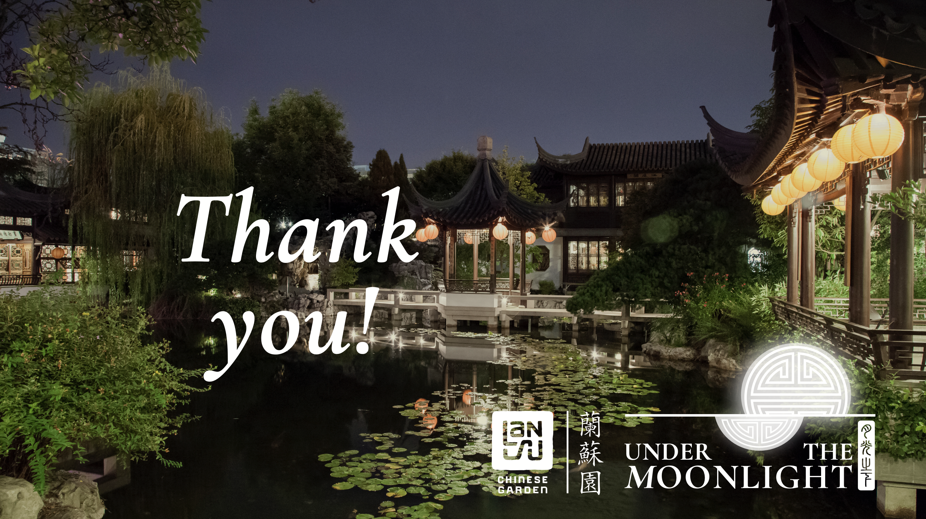
Under the Moonlight
EVENT BRANDING & COLLATERAL CREATION
Since the early-2010s, Lan Su has hosted a fundraising gala under the name “Under the Moonlight. In 2020 the event moved online to a virtual gala format. The event was inconsisently branded over the years, and the executive director wanted to streamline the look of the event for better long-term recognition. I had very little direction beyond “incorporate the moon,” and was given free reign to create a branding suite for the event.
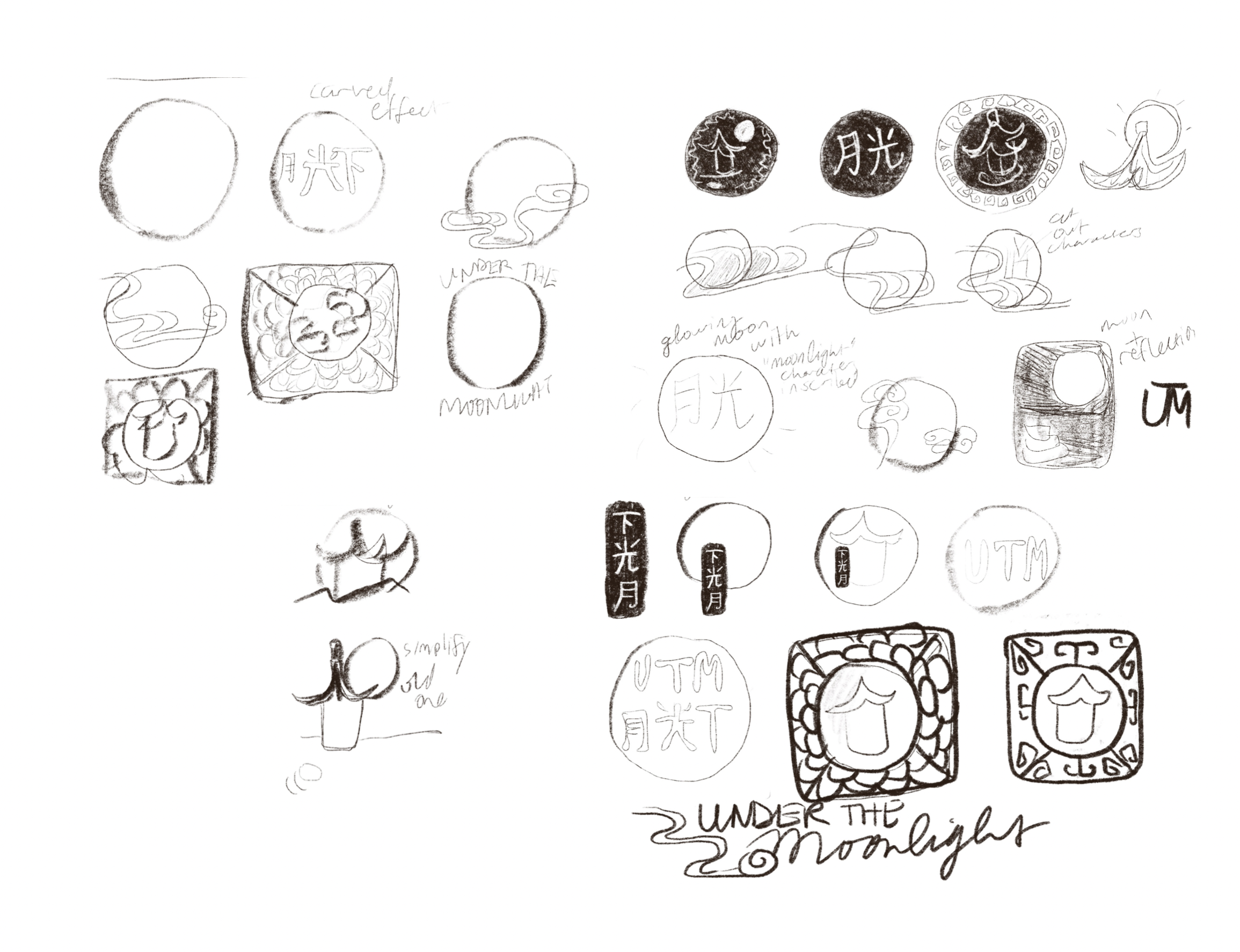
Here are my initial concept exploration drawings based on research and ideation around the themes of Under the Moonlight. I took inspiration from the themes of reslience, longevity, and family togetherness, as well as from imagery and textures with the garden itself.
Under the Moonlight Brand Suite
Primary Logo:
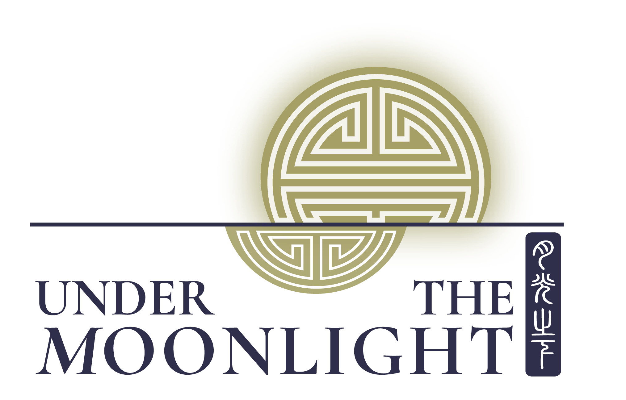
The primary logo features the event name in English, as well as in Chinese in a seal script block. The block text is reminiscent of seals used within the garden for signatures by the artisans who built it. I felt it was important to incorporate Chinese within the logo, as the garden is redirecting its approach to audience building, hoping to attract more of the AAPI community. The central gold image is one of many sybols for longevity in Chinese. I stylized it as if it were the moon rising over a lake. The full moon is culturally important in celebrating Mid-Autumn and Lunar New Year, so it is a nod to community togetherness, celebration, and abundance.
Color Palette:


ecru paper
charcoal
hi-contrast gold
midnight
lan su orange
glowing white
The palette builds on some of Lan Su’s main colors, charcoal, gold, and lan su orange. Since the primary Lan Su logo is bright orange, I was certain to only include new colors that could compliment this bold hue. Midnight blue was a natural choice since it is contrasts well and has strong associations with night. Hi-contrast gold is a higher contrast version of “lan su gold” (which is used in other brand materials). Glowing white is for uses of the logo where it is placed against photography. Finally, since the event is a fundraising gala, I added ecru paper to give digital elements a more luxurious feeling.
Typography:
Typography:

I added Cormorant Garmond to the brand suite for the English logo text and to use as display type. Elegant and sculptural serifs add an elevated feeling to the event while complimenting the existing typography of the Lan Su brand.
Branding in use:
Virtual Save the Date postcard:

This virtual postcard is sent out to invitees to generate excitement for the event, and as a reminder to RSVP.
Virtual event backgrounds: